OWN-BRAND PROJECT / NEXOITEC
Zónn.
A technical service with a human face. Expressive pink, confident typography and a strong visual focus give Zónn a memorable character.
- The work
- Website design & service presentation
- Context
- NexoItec’s own brand
- Languages
- Icelandic & English
- Status
- Service paused · design showcase
01 / BRIGHT PINK
Light, bold and expressive.
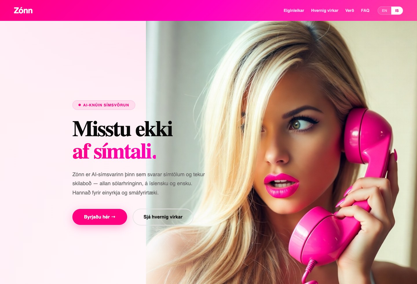
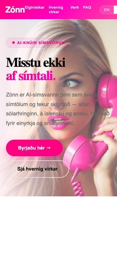
02 / SOFTER ROSE
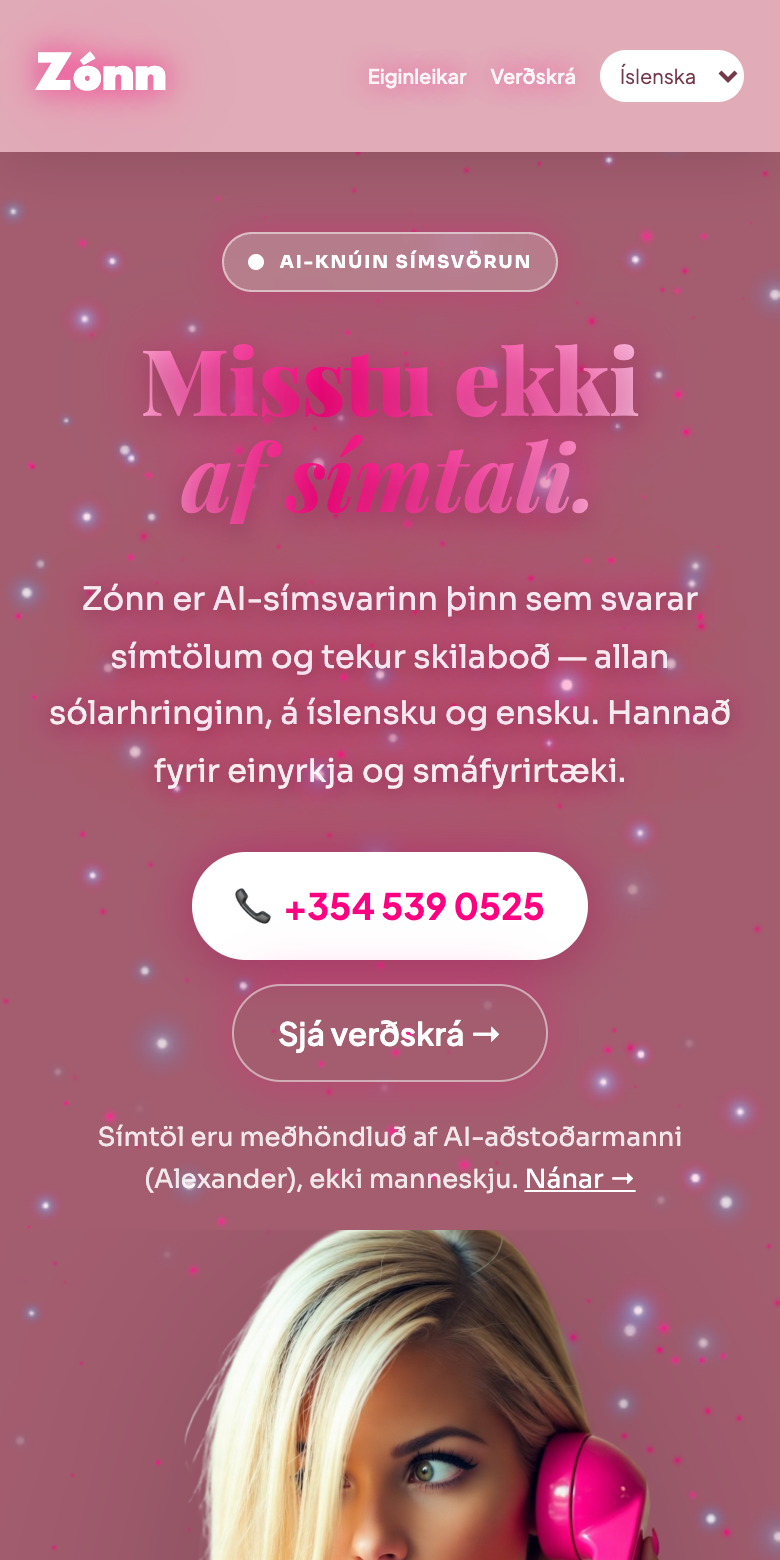
Same brand. A softer direction.
Dusty rose surfaces, light typography and a cut-out portrait give the same idea a warmer, more unified setting.
Scroll through the stars and translucent layers.
Open the live design ↗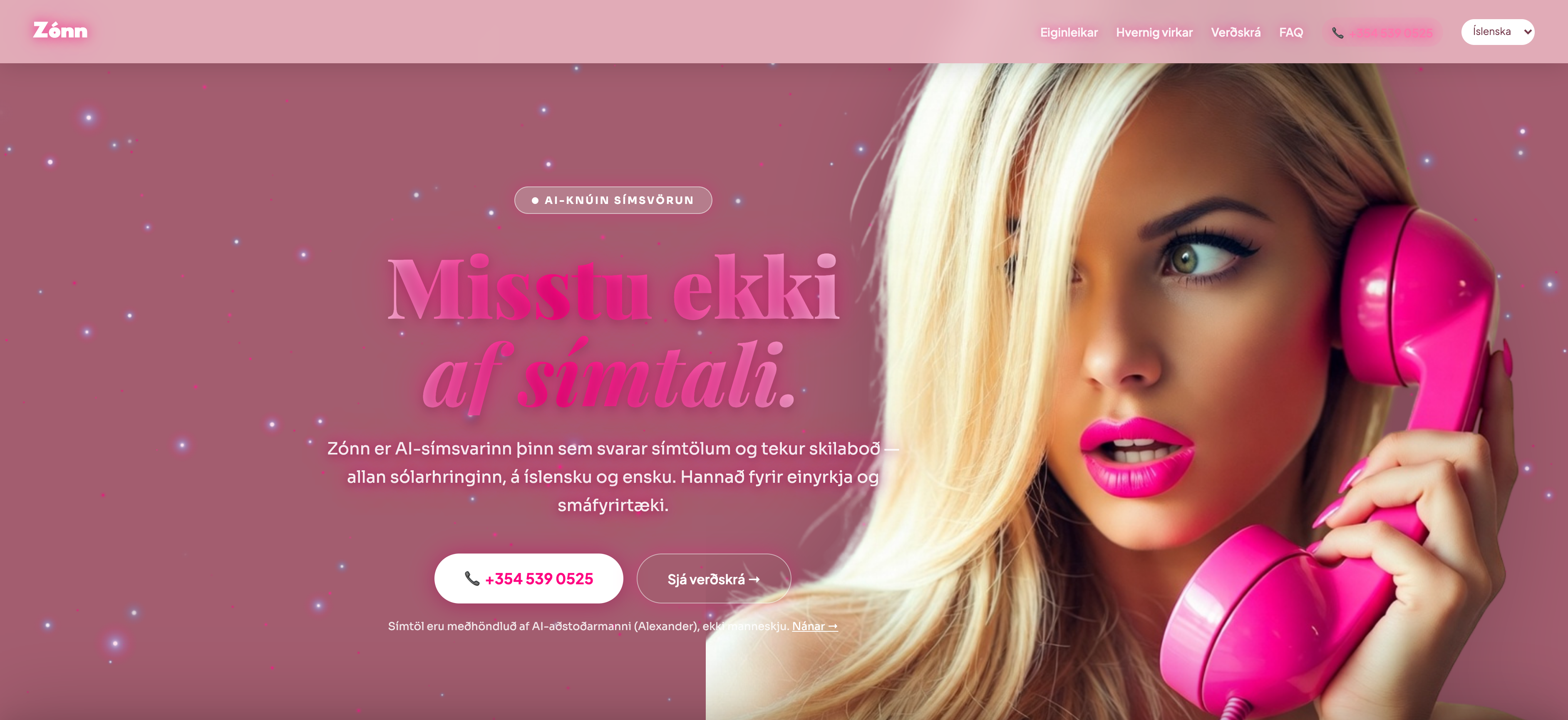
01
An expressive identity
Strong pink and large headlines carry the main message. Light surfaces and generous spacing give the content room to breathe.
02
The service, explained
The site introduces the idea before moving into features, the process and common questions. The information follows a sequence intended to help understanding.
03
Your own visual direction
Zónn shows how one brand can take different visual directions. The next project’s design, structure and content are shaped around the business it needs to serve.
THE NEXT PROJECT COULD BE YOURS